How are my Mars rovers? An interesting design challenge
- 2019年7月10日
- 讀畢需時 5 分鐘
已更新:2023年12月8日
A case that shows the reasons behind my design decisions
---
As a new grad UX designer on OPT, my job search requires some luck and effort. Taking design challenges, however, is one of the most interesting parts of it.
Here's the challenge I got from a startup company after a designer's interview.
(This post is published upon permission from the company.)
Challenge Prompt
Design a Mars Rover Operation Experience that helps engineers
1. see the real-time status of the rover's data to analyze its health
2. quickly set up sensors of a single rover and multiple rovers at a time
3. use "weak AI (providing suggestions but not decisions)" to help set up multiple (10+) rovers at a time.
*sensors and data are: velocity, temperature, and battery use
Time Frame:
1 week (7 hours expected)
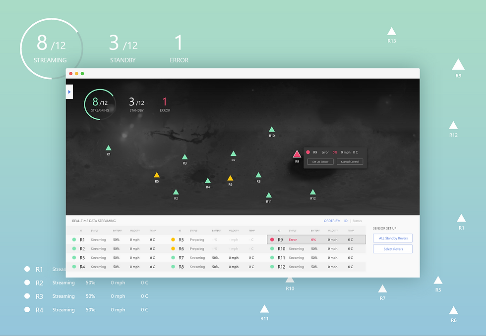
Quick Overview of My Design
1. Color Encoding
helps to check the status of rovers at a glance
2. Map View Dominated UI
Easily identify and review the status of all rovers
3. 4 Ways to Set-up Rovers
Based on specific situations (demonstrated in the last half of the article)
4. Everything At Hand
All essential (frequently used) elements are on the homepage.
No hiding information, no additional layers, and clicks
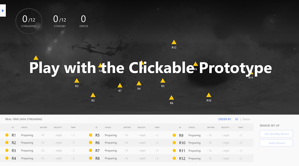
Prototype made with Adobe XD
*Due to lack of hovering effect in the Adobe XD native prototyping tool, the hovering effect on the rover icons is demonstrated with clicking instead of hovering.
Now you see the design. Here's how I made it and WHY.
My Process:
Research (rover functions, device, battery type, landing process, mission, etc.)
Define scope, analyze needs and define design requirements
Brainstorm layout and interaction flows, explore UI patterns
Discuss with an astrophysics scientist and make design decisions
Test the prototype and make adjustments

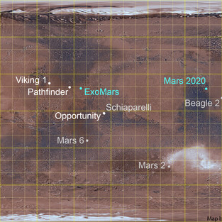

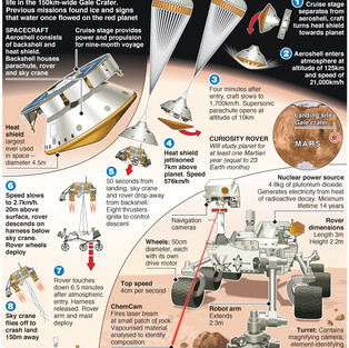

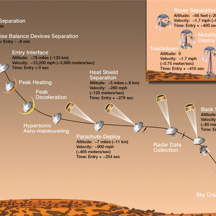
NASA / JPL / USGS (image), Emily Lakdawalla; E&T Magazine; NASA/JPL-Caltech
Asking "WHY"s (Analyzing design needs)
According to the design prompt, the following 2 are the main functions needed:
1. Setting up sensors
2. see the real-time status of the rover's data to analyze its health
But Why? What's the context and why do engineers need these features? What do they want to achieve?
We know that rovers' mission is to collect information (pictures and data) and materials (ex. dust) from Mars.
To accomplish the goal, here's why engineers need these features:
1. set up sensors to initiate the monitoring
→ the operation of "setting up sensors" only happens at the beginning of a rover's journey
→ the operation should be easy to find but not dominating the system UI layout, leaving space for other information and operations.
2. make sure the rovers are healthy so that they can finish tasks as planned. If unhealthy, engineers need to check to identify the problem and take action.
→ users should notice errors (unhealthy rovers) quickly
Defining Design Requirements
So, to achieve their ultimate goal, engineers must be able to:
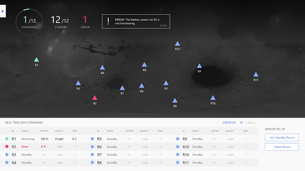
1. check the status of all rovers at a glance
“Are all rovers healthy, sending data back as expected?”
→ This is why we need color encoding and the map view.
2. notice and identify errors easily and quickly
“Is any of them not functioning?”
→ This is why an alert message should appear on top of the page to notify engineers of errors.
→ The design of the summary and color also made it easy for users to notice errors.
3. when an error happens, check the data to see where the problem is
“What’s the problem?”
→ Users can simply hover on the rover to see the data or review the data in the list without needing to click anywhere. Everything's at hand.
(Then, engineers might need to see more detailed data history of the rovers and control the rovers remotely. However, this part of operation isn't covered in the design prompt. In my design, I included a "manual control" button. Also, ideally, if users click on a rover, they should see detailed data history of the rover.)
Based on the previous, I defined basic elements of the system UI:
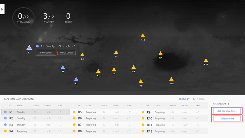
Overview of the status of all rovers
Summary of streaming and failed rovers
Data list of all rovers
Control panel (set up options and others that's not covered in the prompt)
Then, I brainstormed layout variations:

So I got some ideas about the basic elements and layout already.
Now, how should the system work?
-Developing high-level interaction flow
starting from the landing of rovers
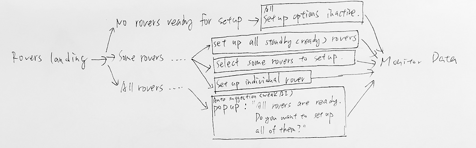
In my design, there are 4 ways to setup rovers:
When no rovers are ready, all sensor setup options are inactive.
When some rovers are active, users can:
1. set up individual rover by hovering on the rover's icon and clicking on "Set up Sensor."
2. set up all standby rovers at a time by clicking on "All Standby Rovers" in the sensor set up the control panel.
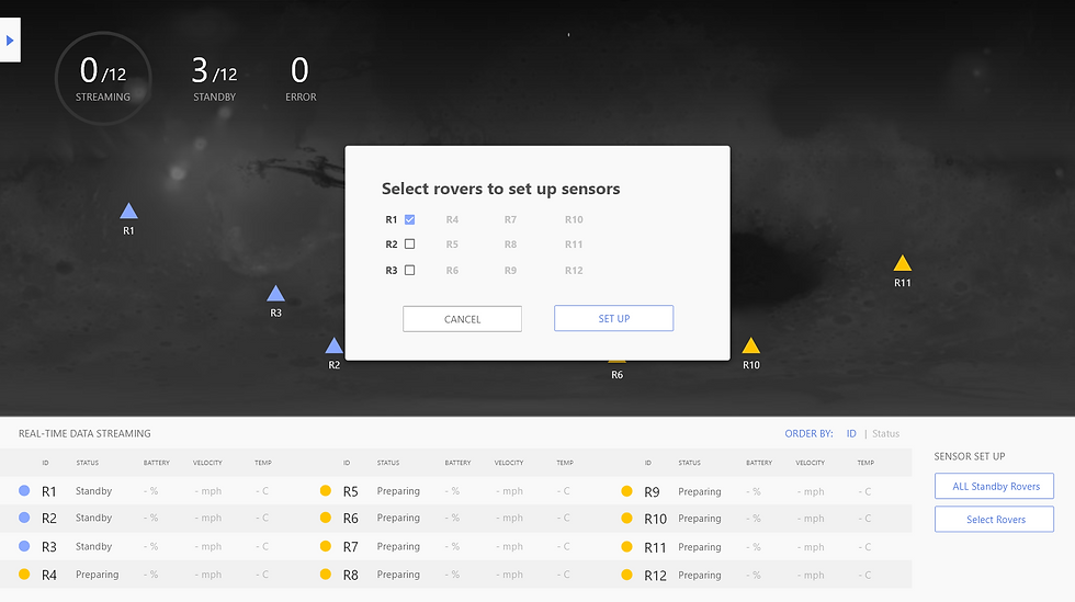
3. set up several rovers at a time of user's selection at a time by clicking on "Select Rovers" in the sensor set up the control panel.
4. when all rovers are in standby status and are ready for setup, the system will notify users with a popup, asking if users want to set up all rovers at a time. (weak AI)
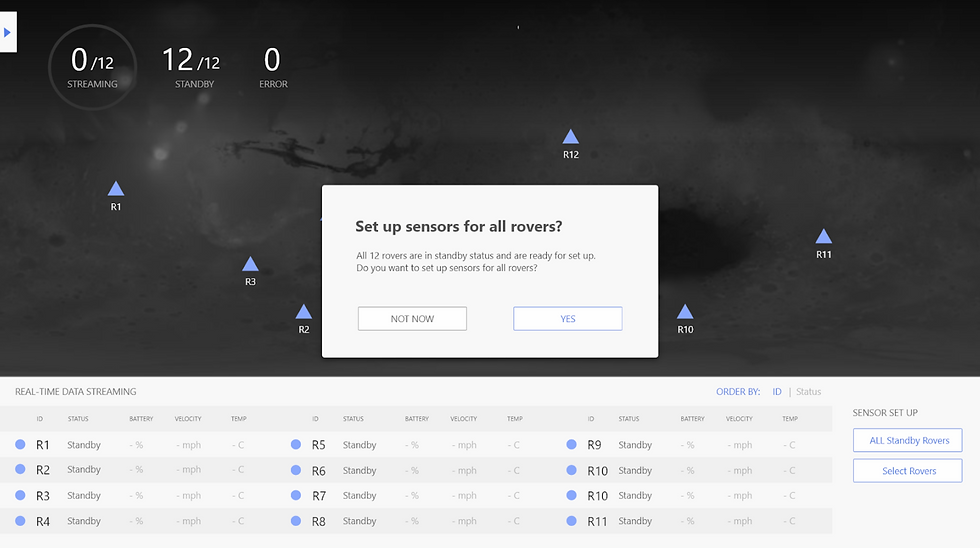
The popup shows the progress of setting up sensors.
This is important because there would be a time delay in the data transmission from the earth to mars. Setting up sensors is not a click-and-done thing. So it's better to show the progress and possible issues that could happen in the process.

When it's done, the pop shows the result.


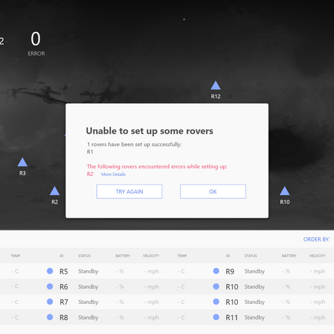
When errors occur, engineers will be notified with the alert message that appears on top of the page.
Rovers with an error are highlighted with the red color.
Design Decisions
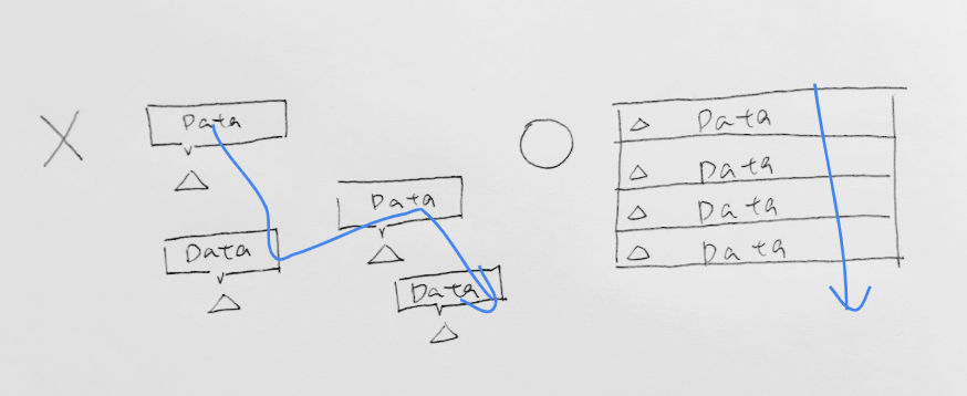
Map View over Data List View as the dominant UI layout
Because location provides more background context (location, mission carried, surroundings, weather and landscapes that the rover might encounter, etc.) than IDs and helps engineers map the information (status) with individual rovers
Display data in a list instead of scattering on the map
Because it’s easier to glance through the data of all rovers.
...and many more others. Feel free to come ask/discuss with me!
Result of the design challenge: Sadly, I wasn't invited to the next stage. However, I fully enjoyed the challenge and want to share the experience and collect feedback for improvements.
Other Reflections: Considering the time delay of data transmission from the Earth to Mars, "Last Updated Time" might also be important information to include in addition to the data itself to provide more accurate information for the engineers.
Questions? Comments?
I'd love to hear feedback and honest critiques. As a new grad UX designer, I hope to know where I did well and where to work more to get better chances.
Feel free to send me a message on linkedin to simply comment or let's find a time to talk (bay area)!
Additional Information:
The Scope, Constraints and Assumptions I made
Based on the time frame and the focus of the design challenge, the following aspects/ functions are not considered:
Data history data update history and navigation history
Direction and path of the rovers
Accessibility (ex. color blind)
Rover manual control interface
Research data (pictures, dust) collected by the rovers
Assumptions:
Setting up sensors is a one-way operation. No need to turn off sensors after set up

留言